From Residual Load To Price Scenarios — Calibrating A Jump–diffusion Model
October 2025 (2804 Words, 16 Minutes)
Two weeks ago, I shared an article about how Jump Diffusion models can be used to simulate power prices. You can check it here → Simulating spot prices with jump diffusion model.
I received more feedback than expected, so now I have to commit to what I promised: describing how I’d calibrate such a model.
I went through my usual process, which can be summarized as a four-step cycle:
- Read a lot (I’ll share a short bibliography at the end)
- Talk alone (it’s key)
- Drink (at least) one coffee
- Write and repeat
After taking a few hours to reflect, I clarified the problem that I’ll be solving:
Simulating 2025 daily peak prices in France using residual load and 2023–2024 historical data
Residual load is defined as the difference between national consumption and solar + wind energy production.
Why this problem?
- I already have the data (yes that’s not a very good reason, but it’s convenient).
- Daily prices are well-suited for a side project : easier to model and visualize than hourly price (again: convenient).
- Using residual load as the main price driver is relevant, and it’s a great way to include deterministic seasonality in a jump diffusion model.
- I’m focusing on peak prices (8h–20h weekdays in France) because the growth in solar capacity must have an impact on them (and by definition, on residual load).
Process and Article Goal
My objective is to give an intuition of how I calibrated my 2025 peak prices scenarios. This article will already be long for a blog post and then I won’t share any code here (check my GitHub). I also know a lot of things could probably have been done better, as I’m still improving the functions, so please feel free to reach out with any thoughts or suggestions.
By the end of this article, I’ll have generated between 1,000 and 10,000 scenarios for 2025, trained on 2023–2024 price data for France.
Evaluating the Scenarios
Once the 2025 price scenarios are simulated, I need a way to check how realistic they are compared to the actual 2025 data (up to October). Below are the metrics I use to evaluate this consistency:
- Coverage at 50% :
- Fraction of real daily prices that fall within the 50% central interval of simulated prices.
- Coverage at 90% :
- Fraction of real prices within the 90% prediction interval.
- Tails :
- Frequency of extreme values in simulated scenarios. Compares the percentage of negative, >200% and >300% mean values with actuals.
- Mean CRPS :
- Continuous Ranked Probability Score, which measures how close the forecast distribution is to reality. Lower is better.
Together, these metrics help me assess whether the simulated distribution:
- Covers real-world variability (via the coverage ratios),
- Handles extreme events realistically (via the tails),
- And stays statistically close to observed prices (via the CRPS).
🧠 A Note on the CRPS
Mathematically, the Continuous Ranked Probability Score (CRPS) for a forecast distribution \(F\) and an observed value \(x\) is defined as:
\[\text{CRPS}(F, x) = \int_{-\infty}^{+\infty} (F(y) - 1\{y \ge x\})^2 \, dy\]where \(F(y)\) is the cumulative distribution function (CDF) of the forecast and \(1\{y \ge x\}\) is the indicator of whether \(y\) exceeds the observed value.
Intuitively:
- CRPS measures how far the predicted distribution is from the reality at each possible value of the variable.
- A perfect forecast (where the distribution matches the observation exactly) gives CRPS = 0.
- Wider (too much uncertainty) or misplaced distributions (too much bias) increase the CRPS.
It can be seen as the probabilistic analogue of the Mean Absolute Error (MAE) but, instead of comparing single predictions to single outcomes, it compares forecast distributions to the actual realization.
Creating the Deterministic Baseline
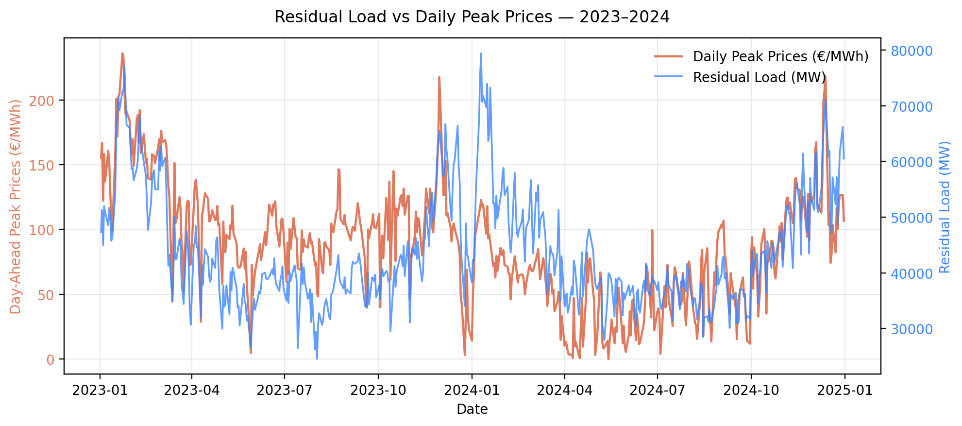
First, let’s create the baseline. It must capture the underlying seasonality of power prices — and my assumption is that residual load (RL) can represent this seasonality. The chart below shows the two series are indeed correlated :
I used a Generalized Additive Model (GAM) (see note below) to fit prices as a smooth, non-linear function of residual load.
🧠 A Note on the GAM Model
A Generalized Additive Model is a flexible regression model that allows each predictor to have its own smooth effect on the response variable. Mathematically, it can be written as:
\[E[Y] = \beta_0 + f_1(X_1) + f_2(X_2) + \dots + f_n(X_n)\]where each \(f_i\) is a smooth, data-driven function (often splines). We can also have function of several variables (we’ll use this property in our model), an intercept or linear relations.
Intuitively:
- It’s like a linear model, but with curves instead of straight lines.
- GAMs are ideal when you don’t know the exact functional form between variables (for example, how much a price changes when residual load increases).
- They capture non-linearities without overfitting, which is perfect for electricity prices that often follow complex, threshold-based behaviors.
Adding Time Effects
Because there was a downward trend in prices during 2023, I extended the model to include a smooth temporal component:
\[\text{Price} = f(\text{Residual Load}) + f(\text{Month, Year})\]This bivariate term helps capture the slow market trends and seasonal variations not explained by residual load alone. Let’s observe the residuals of the models :
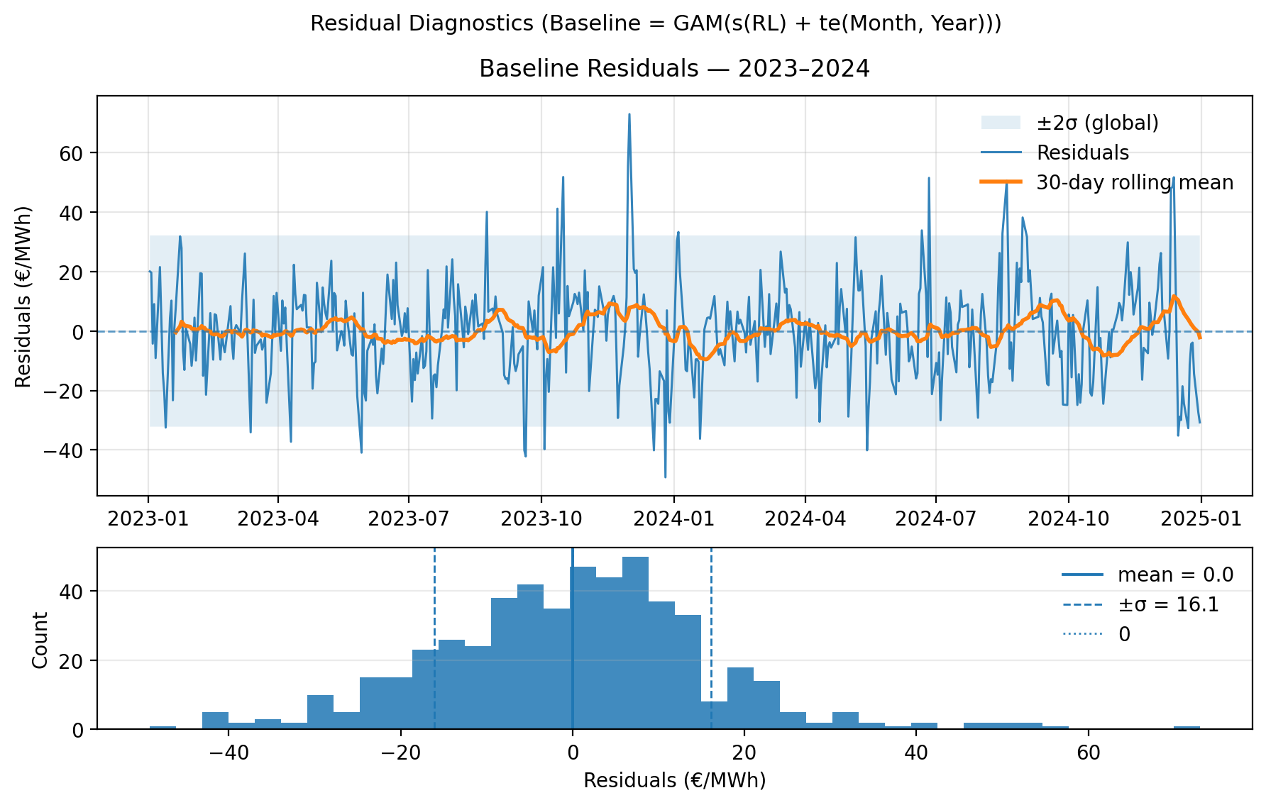
The model produces well-centered residuals (mean is around 0). The ±2\(\sigma\) band (~±32 €/MWh) looks relatively stable, though some bursts of volatility appear (winter 2023–24), and the residual spread seems narrower in spring/summer. This suggests heteroskedasticity and we’ll try to manage that later in this article through the modelisation of volatility.
There is also weak autocorrelation but no structural drift. The histogram is roughly bell-shaped but is slightly left-skewed (more negative residuals) and has heavy tails, especially on the right (occasional high positive spikes). Actually it makes sense for power prices to observe rare upward shocks (“price jumps”) and smoother negative deviations.
Extending the GAM Temporal Term
In the GAM model, I have a smooth term for Month × Year. But since 2025 was not part of the training set, I had to extend this term artificially.
To do so, I reused the 2024 monthly pattern and re-anchored it so that each month’s average corresponds to December-24 forward prices (the last available futures quotations). This ensures the model remains consistent with the forward curve at the time of calibration.
From Baseline to Simulation
Past residual loads are behind us, and our baseline is now set. But we don’t yet know the residual load for 2025 then how can we generate our price scenarios?
Simple: we’ll simulate residual load next.
Simulating Residual Load Scenarios
To generate 2025 residual load (RL) scenarios, I built a small simulation framework in Python that relies on three key ideas: (1) resampling past patterns, (2) inflating their variability, and (3) adjusting the mean level to reflect 2025 expectations.
1️⃣ Moving-Block Bootstrap
The core of the method is a moving-block bootstrap applied to historical residual load series.
Instead of sampling single days independently, I resample 7-day blocks from the historical time series (2023–2024) to preserve short-term autocorrelation (e.g. multi-day cold spells or windy weeks). Each simulated path is constructed by concatenating random 7-day chunks taken from the historical record, within a ±15-day seasonal window around each target calendar day.
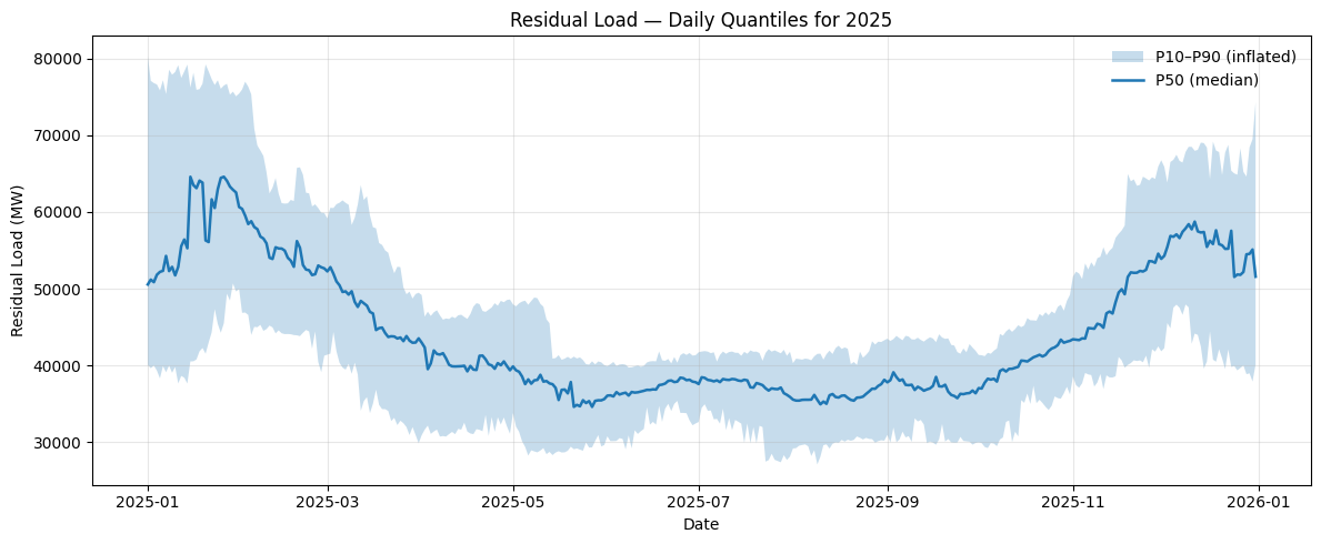
Formally, for a target day-of-year \(d_t\), we draw a block from: \(\mathcal{B}_t = \{ RL_i \mid |DoY_i - d_t| \leq 15 \}\) and repeat until we fill all 365 days. This creates \(N = 200\) stochastic trajectories of daily residual load for 2025.
2️⃣ Dispersion Inflation (+25%)
After generating all scenarios, I compute daily quantiles (P10, P50, P90) across them. The next step is to slightly inflate the spread around the median (P50) to capture more uncertainty. I’ve chosen to do it as I only have two years of data which can produce too narrow quantiles.
Mathematically, for each quantile \(q_p\): \(q_p' = P50 + k \times (q_p - P50)\) with \(k = 1.25\), i.e. a 25% inflation of dispersion.
This keeps the median unchanged while making the tails more realistic : accounting for the uncertainty inherent in 2025 weather, demand, and renewables.
3️⃣ Structural Adjustment on Residual Load (−10%)
Finally, I applied a 10% downward adjustment to residual load levels to reflect expected structural changes:
- Demand destruction due to lower industrial activity,
- Higher solar capacity leading to reduced net load during daylight hours.
Importantly, this adjustment is implemented as a downward dispersion, not a global shift and, as a consequence, the median remains the same, but the lower quantiles extend further down.
This is a raw assumption that would deserve refinement in a future version (e.g. by explicitly modeling new solar capacity or demand elasticity).
The result is a set of 200 realistic 2025 residual load trajectories with each preserving historical patterns while incorporating plausible uncertainty.
Modeling the Jumps
regarding jumps, we need to calibrate both their frequency and intensity. To do that, I use a method called Recursive Jump Filtering. Let’s go through it :
1️⃣ From Residuals to Innovations
We start from the residuals of the GAM model (price – fitted value). For each day, we compute the innovation, i.e. the day-to-day change in residuals:
\[\Delta x_t = x_t - x_{t-1}\]This represents how much the residual changed since yesterday (the “shock” not explained by the deterministic baseline).
2️⃣ Detecting Outliers (First Pass)
We then look at all these innovation values and compute their z-score:
\[z_t = \frac{\Delta x_t - \bar{\Delta x}}{\sigma_{\Delta x}}\]Since the mean innovation is typically close to 0, this z-score tells us how many standard deviations away from “normal” each daily change is. If \(\lvert z_t \rvert\) exceeds a threshold \(c\) (for instance, \(c = 3\)), we count that day as a jump. \(c = 3\) is often chosen and if the innovation follows a normal law, then 99,87% of the values will have \(\lvert z_t \rvert > 3\sigma\). For this use case, I prefer a lower threshold and choose \(c = 2,5\).
3️⃣ Refining the Standard Deviation (Recursive Filtering)
However, extreme outliers increase the standard deviation, which makes fewer points appear as outliers — because the threshold \(c \times \sigma\) becomes too wide.
To correct for that, we use a recursive filtering approach:
- Compute mean and standard deviation on the clean set (excluding detected jumps).
- Recalculate z-scores for all points.
- Identify new jumps (\(\lvert z_t \rvert > c \times \sigma_{\text{clean}}\)).
- Repeat until the list of jump days stops changing.
This simple recursion stabilizes the set of detected jumps and gives us a robust estimate of volatility and extreme moves.
4️⃣ Summarizing Jump Events
Once the list of jumps is stable, we summarize the results:
- Count
- Total number of jumps detected.
- Frequency :
- Average number of jumps per year.
- Mean amplitude :
- Average jump size (in €/MWh).
- Mean positive jump :
- Average magnitude of upward jumps (in €/MWh).
- Mean negative jump :
- Average magnitude of downward jumps (in €/MWh).
In the end, this procedure gives us an empirical jump intensity (λ) and jump size distribution, which will feed directly into our stochastic model for price simulation.
Mean Reversion Calibration
The idea of mean reversion is that deviations from the deterministic trend (residuals) tend to revert toward an equilibrium level. I used a Weighted Least Squares (WLS) regression to fit the continuous-time Ornstein–Uhlenbeck (OU) process:
\[dx_t = \alpha (\bar{x} - x_t)\,dt + \sigma\,dW_t\]where:
- \(\alpha\) is the speed of mean reversion,
- \(\bar{x}\) is the long-term mean,
- \(\sigma\) is the volatility of the stochastic noise.
Estimation Steps
- Compute daily increments \(\Delta x = x_t - x_{t-1}\) and corresponding time steps \(\Delta t\). As we are working with peak price, \(t\) is sometimes a Monday and \(t-1\) a Friday then \(\Delta t\) is not always equal to one.
- Run a regression of \(\frac{\Delta x}{\Delta t}\) on \(x_{t-1}\) with weights proportional to \(\Delta t\).
- From the fitted coefficients:
- \[\alpha = -\text{coef}(x_{t-1})\]
- \[\bar{x} = \text{intercept} / \alpha\]
- \[\sigma = \sqrt{E[(\text{residuals})^2 \, \Delta t]}\]
- The half-life of mean reversion is then: \(t_{1/2} = \frac{\ln(2)}{\alpha}\)
⏳ A Note on the Half-Life
The half-life of mean reversion represents the time it takes for a deviation from the long-term mean to decay by half.
Mathematically, for a reversion speed \(\alpha\):
Intuitively:
- A short half-life (for example, a few days) means shocks fade quickly — the system “forgets” recent deviations fast.
- A long half-life implies that shocks persist and prices take longer to return to equilibrium.
In power markets, half-lives reflects how rapidly prices revert toward fundamental levels after temporary supply–demand imbalances.
Output
In our case, the calibration gave \(\alpha\) = 0.390 per day (half-life ≈ 1,78 days)
This tells us that deviations from the mean typically fade by half within about 2 days, which is fast but consistent enough with how price shocks behave in short-term power markets.
Modeling Volatility
Volatility is, in my opinion, the most complex part of the model. I experimented with three different methods before settling on the one that felt most realistic.
1️⃣ Naive Yearly Volatility
The simplest approach is to compute a single volatility parameter from the residuals observed in 2023–2024.
\[\sigma_{\text{year}} = \text{std}(\text{residuals}_{2023-2024})\]This gives a global level of variability, but it ignores the fact that price volatility depends strongly on system conditions — especially residual load.
2️⃣ Residual-Load–Dependent Volatility
To improve on that, I computed volatility coefficients by residual load bins. For example, I divided the historical residual load into quantile bins (low, medium, high) and calculated a separate volatility parameter for each bin.
Intuitively, this captures the idea that:
- When the residual load is low (lots of renewables), prices are calmer.
- When the system is tight (high residual load), volatility tends to spike.
3️⃣ Residual-Load– and Season–Dependent Volatility
Finally, I extended the idea by combining residual load and seasonality and I created bins by both load level and season. This approach remains simple but more realistic:
- It acknowledges that volatility structure changes throughout the year,
- And that tight system margins amplify price dispersion.
I preferred this last method — it’s still rudimentary, but it gives a more credible description of how volatility behaves in power markets.
Simulation on 2025
With the bootstrap method, we have created 200 residual load scenarios for 2025. For each of these, we generated corresponding price scenarios using the parameters estimated in the previous sections (baseline, volatility, jumps).
Finally, we compared the simulated prices with actual 2025 daily peak prices (available up to October). No more suspense — here is the visualization:
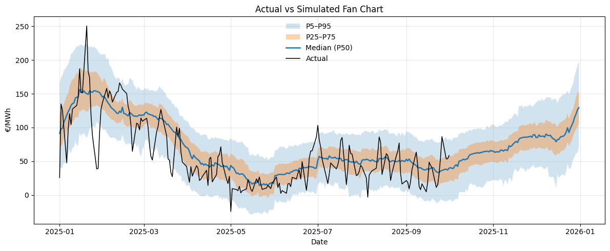
Reading the Fan Chart
The blue line represents the median simulated price (P50). The shaded areas correspond to:
- Light blue: the 5th–95th percentile range (P5–P95),
- Orange: the 25th–75th percentile range (P25–P75),
- Black line: the actual daily peak price observed in 2025.
Qualitatively:
- The seasonal pattern is well captured: winter peaks, spring dip, summer volatility, and a slow ramp-up into Q4.
- The median tracks reality quite closely until early summer, after which real prices remain slightly more volatile than the simulations.
- The fan width expands from spring to winter, consistent with increasing market uncertainty.
- Overall, the model seems to reproduce both the trend and the scale of variability reasonably well.
Evaluation Metrics
- Overlap days — 196
- Number of days overlapping between simulation and actual data.
- Coverage at 50% — 0.51
- Fraction of actual prices within the 50% prediction band.
- Coverage at 90% — 0.90
- Fraction within the 90% prediction band.
- Mean CRPS — 15.95
- Continuous Ranked Probability Score (lower = better).
- Tails actual — 1.0% negative, 0.5% > 200%, 0% > 300%.
-
Share of real data in extreme zones:
- Tails simulated — 5.0% negative, 1.4% > 200%, 0.01% > 300%.
-
Share of simulated data in same zones:
Interpretation:
- The 90% coverage close to 0.9 indicates that simulated price distributions are well-calibrated : they encompass most real outcomes.
- The 50% coverage around 0.5 suggests a good central alignment (the model doesn’t systematically over- or underpredict).
- CRPS ≈ 15.9 is in line with other probabilistic power price models: not perfect, but robust for a low-dimensional simulation.
- The tails show that the model slightly overestimates negative price events (5% vs 1%) but captures upward spikes reasonably well. This is expected since jumps were calibrated conservatively.
Coverage by Month
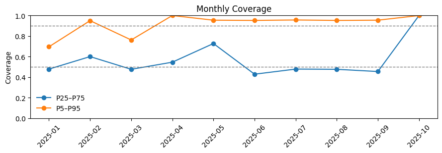
Monthly coverage confirms that:
- The model performs best in spring (April–May) where volatility is moderate and well-learned from history.
- Winter (January–February) remains well-calibrated despite larger jumps.
Overall, this first version of the jump-diffusion simulation manages to reproduce the main structure and variability of 2025 daily peak prices, using only historical patterns, residual load, and minimal market assumptions.
References
Clewlow, L., & Strickland, C. (2000). Energy Derivatives: Pricing and Risk Management. London: Lacima Group.
Alcock, J., Goard, J. M. & Vassallo, T. (2008). Calibrating mean-reverting jump diffusion models: an application to the NSW electricity market. In T. R. Marchant, M. P. Edwards & G. Mercer (Eds.), Proceedings of the 2007 Mathematics in Industry Study Group (pp. 57-76). Wollongong: University of Wollongong.
Blanco, C. & Soronow, D.. (2001). Jump diffusion processes-Energy price processes used for derivatives pricing and risk management. Commodities Now.