Survival Analysis For Negative Price Events
January 2026 (2959 Words, 17 Minutes)
This article is indeed one more piece on negative prices in day-ahead markets — but my real motivation behind this post lies in the method, not the topic itself. Allow me a quick autobiographical detour (it’s my blog, so I allow myself one).
In 2019, still a student, I joined a consulting firm, Seabird, specialised in the insurance sector as an apprentice where I eventually worked for four years (three of them under a permanent contract after my one-year apprenticeship). This same year, 2019–2020, was also my final year in engineering school. My major was data science, but I decided to take additional actuarial science courses to stay consistent with my new role. That is how I ended up spending several hours wrestling with survival analysis models and duration models. Survival analysis focuses on durations and is traditionally associated with medical studies (“how long until a patient relapses or dies?”) or insurance (“how long until a claim occurs?”).
Seven years later, after switching to the energy sector, I am still strongly convinced that survival analysis methods are extremely useful, simple (yet robust), intuitive, and underexploited in energy markets. I had been looking for a way to reuse them in my current position, and studying the persistence of negative prices quickly appeared as the most obvious use case.
That said, I was initially unconvinced. Another article on negative prices did not feel particularly necessary.
Then I started digging deeper and found several related use cases in the literature (lifetime of power transformers (see Martin et al., 2018) or estimation of remaining useful life of hydropower units (see Barbosa de Santis et al., 2023)). What ultimately tipped the balance was an innovative paper by Zamundio Lopez and Zareipour (2025), applying the Kaplan–Meier estimator (a non-parametric survival analysis tool introduced almost seventy years ago by Kaplan and Meier) to price spikes. That work validated my intuition: if you simply flip the threshold used to define a price spike, replace it with zero, you can reproduce a very similar analysis for negative prices.
This is essentially what I propose to do here, with two differences:
- the focus is on European day-ahead markets, and
- I would like to go slightly further than a pure Kaplan–Meier analysis.
To sum up, the main objective of this article is to introduce survival analysis through a concrete energy-market application by answering a simple question: how long do negative prices actually last? This will be a two-part article. This one, the first part, focuses on the Kaplan–Meier estimator and hazard rates. A second part may go further — probably using a Cox proportional hazards model (see Cox, 1972) or even tree-based survival methods to explain why negative prices persist. But that part is not written yet. Let’s take one thing at a time.
This article is organized as follows : using the pretext of studying negative prices (for France, Germany, the Netherlands and Spain), the first three sections introduce the Kaplan-Meier estimator to demonstrate its complementarity with traditional tools like histograms. Then the last section deepens the analysis by introducing new countries, new variables and yearly distinctions.
In this article, I’ll use day-ahead prices and wind and solar load forecasts from the ENTSO-E Transparency Platform for several Western European countries. I’ll focus on the 2021-2025 period and use hourly prices (quarter-hourly prices after October 2025 are aggregated to ensure consistency over the period).
1. What we analyze: The duration of an event
Survival analysis focuses on a random variable \(T\), representing the time until an event ends (or occurs).
In our context:
- the event is a negative price spell, which starts when a price is strictly below zero and ends when the price goes back over zero again.
- \(T\) is the duration of that spell (measured in hours). The duration is always positive.
Day-ahead auctions take place for the next day then, in theory, a negative spell can be right-censored meaning that if the spell is still ongoing at the end of the observed period, we can’t know its true duration. Even if it remains very unlikely for negative prices, being able to deal with right-censoring is a huge advantage of survival analysis.
2. The limits of histograms and averages
Before going further into survival analysis, it is worth clarifying why more traditional tools, such as histograms and averages (or median), fail to fully address the question we are interested in. Of course, it doesn’t mean they are not useful or complementary. In fact histograms already reveal several important structural facts about negative price spells in European day-ahead markets.
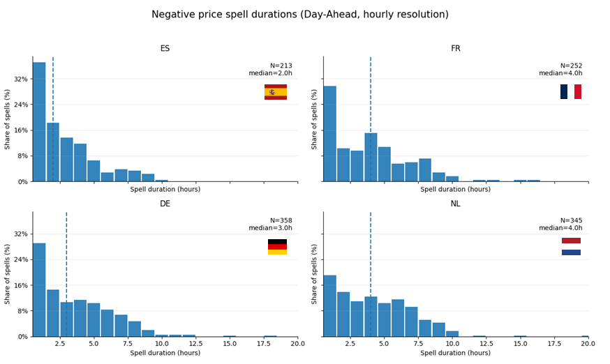
Across all four countries, spell durations are heavily right-skewed. The majority of spells are short-lived with a modal duration of 1–2 hours. However a long tail of persistent events exists in every market.
This shape immediately rules out Gaussian assumptions and already hints that averages will be misleading.
Even if the mean duration is the same, a market with many short spells and a few very long ones does not behave like a market with moderately persistent negative prices. The dashed vertical lines show the median spell duration. At first glance, this suggests a simple ranking: Spain resolves negative prices faster, France and the Netherlands more slowly.
What really differentiates markets is the tail behaviour:
- Spain has very few spells beyond 6–7 hours.
- Germany exhibits a longer tail, with non-negligible mass up to ~10 hours.
- France and the Netherlands show the heaviest tails, with rare but very persistent events extending well beyond 10 hours.
Histograms ignore time ordering
A histogram of negative price spell durations treats each spell as an independent observation, disconnected from time:
- a spell lasting 1 hour and one lasting 10 hours are simply counted as two observations,
- the histogram does not tell us when spells tend to end,
- nor how the probability of termination evolves as time passes.
In other words, histograms do not directly answer the question:
“Given that a spell has already lasted 3 hours, how likely is it to end now?”
Histograms and averages fail to handle censoring properly
I already wrote that censoring occurs whenever the full duration of a spell is not observed.
In practice, this happens when a negative price spell is still ongoing at the end of the dataset, or when data availability changes due to market design or resolution.
Histograms and averages handle such observations poorly and that introduces bias:
- censored spells are either dropped (persistence is underestimated),
- or treated as if they had ended exactly at the observation cutoff (true duration is misrepresented).
3. Introducing the Kaplan-Meier Estimator
These histograms are useful but only descriptively to show skewness, heterogeneity across countries, and the existence of long tails.
What they cannot show is:
- how persistence decays over time,
- how conditional risk evolves hour by hour,
- or how to compare markets dynamically rather than statically.
To answer these questions, we now shift from frequency-based descriptions to time-conditional probabilities, using the Kaplan–Meier estimator. Let’s define it formally.
The survival function
The central object in survival analysis is the survival function, defined as:
\[S(t) = \mathbb{P}(T > t)\]In plain language:
\(S(t)\) is the probability that a negative price spell lasts longer than \(t\).
It can be interpreted as:
-
\(S(1) = 0.6\)
→ 60% of negative price spells last more than 1 hour. -
\(S(3) = 0.1\)
→ only 10% last more than 3 hours
Unlike a simple average duration, the survival function tells us how persistence decays over time.
Kaplan–Meier: formal definition
The Kaplan-Meier (KM) estimator is a non-parametric estimator of the survival function. It makes no assumption about the underlying distribution of durations (and this property is very desirable in electricity markets).
Formally, it is defined as:
\[\hat{S}(t) = \prod_{t_i \le t} \left( 1 - \frac{d_i}{n_i} \right)\]Where:
- \(t_i\) are the observed event times,
- \(d_i\) is the number of spells ending exactly at time \(t_i\),
- \(n_i\) is the number of spells still ongoing just before \(t_i\).
Although survival analysis is often introduced in continuous time, the Kaplan-Meier estimator works perfectly well in discrete time, fortunately for us.
Kaplan–Meier: the step-by-step intuition
The KM estimator works as follows:
- Start with all negative price spells “alive”
- Move forward in time
- Each time some spells end, the survival probability drops
- The drop is proportional to:
- how many spells end,
- relative to how many were still alive
Note that this estimator explicitly accounts for censoring:
- censored spells contribute information up to the time they are observed,
- without artificially assuming when they end.
This is a key reason why survival methods are widely used in fields where observation windows are finite, such as medicine, where right-censoring due to loss to follow-up is frequent.
This produces the characteristic step-shaped curve:
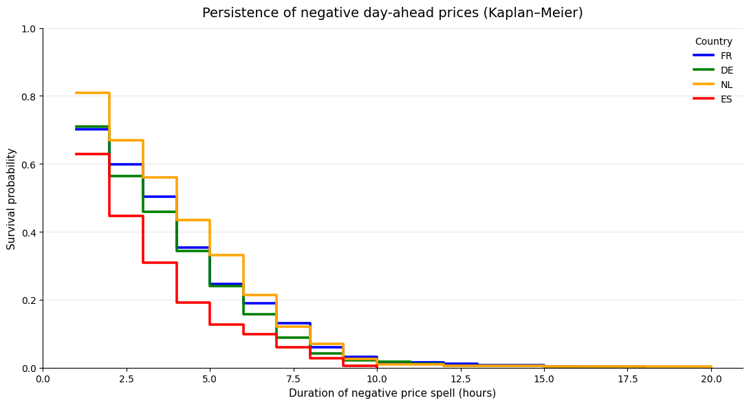
Each curve represents how negative spells behave in a different country. All four curves drop sharply during the first hours. This confirms that most negative price spells are short-lived.
However, the speed of decay differs noticeably across countries:
- Spain (ES) exhibits the steepest early drop: negative prices resolve quickly once they appear (after ~2 hours, survival is well below 50%).
- Germany (DE) follows a similar but slightly slower pattern (after ~2 hours, survival is around 55–60%).
- France (FR) and especially the Netherlands (NL) display much higher early survival probabilities (after ~2 hours, survival is closer to 65–70%).
Beyond 8–10 hours, survival probabilities are low in all countries but they are not zero. Notably:
- NL and FR maintain non-negligible survival mass further into the tail,
- ES almost completely disappears beyond ~8 hours.
Tail behaviour differs more strongly than central tendency.
An important feature of the figure is that the curves do not cross and remain ordered over most of the duration range. This suggests that persistence differences are systematic, not driven by a few extreme events. If negative prices were governed by the same underlying dynamics across markets, we would expect the curves to overlap more or cross frequently.
You remember that France and the Netherlands exhibited the same median duration? Well, we see on the previous plot that once a negative price spell starts, it is initially more persistent in NL than in FR (until 4h, the NL curve is above the FR curve). Then, conditional on having already lasted several hours (around 5-6h), the remaining lifetime of negative price spells is similar in France and the Netherlands.
The stepwise nature of the curves also hints at preferred termination times. This motivates the next layer of analysis:
- hazard rates to identify when spells are most likely to end,
- and, later, covariate-based models (e.g. Cox) to explain why persistence differs across markets.
4. Hazard rate: when do spells tend to end?
Closely related to the survival function is the hazard rate, defined as:
\[h(t) = \mathbb{P}(T = t \mid T \ge t)\]In words:
The probability that a negative price spell ends at time \(t\),
given that it has lasted until \(t\).
In discrete form, this can be estimated as:
\[h(t) = \frac{d_t}{n_t}\]Where:
- \(d_t\) is the number of spells ending at time \(t\),
- \(n_t\) is the number of spells still ongoing at time \(t\).
The hazard rate is particularly useful to identify preferred termination times, for instance when negative prices tend to resolve after one or two hours due to market or operational constraints.
I computed the hazard rates for the four countries of this study. I decided to smooth the rates and only display those for times with more than 30 spells ongoing. This is what is represented on the left plot below. On the right, you can observe cumulative hazard which is basically the sum of all hazard rates up to time t.
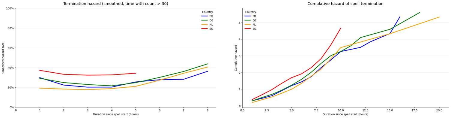
Perfectly aligned with the KM analysis, Spain (ES) exhibits the highest early hazard: once a negative price appears, it is comparatively likely to resolve quickly. France (FR) and Germany (DE) show intermediate early hazards. The Netherlands (NL) displays the lowest early hazard, indicating stronger early persistence.
Beyond ~6 hours (still under the n_at_risk ≥ 30 constraint), hazards across FR, DE and NL begin to converge toward similar levels (≈30–40%).
All markets display a broadly U-shaped hazard pattern:
- hazards decline slightly after the first hour,
- reach a local minimum around 2–4 hours,
- then increase steadily beyond ~4–5 hours.
That means that once a negative price spell survives the initial adjustment phase, its probability of termination increases again.
5. Let’s continue with the analysis
I’ve been dropping several plots along my previous explanations. We can go further with the same level of complexity. Below some ideas of analysis :
Adding more countries
A first thing we can do thanks to the Transparency platform is to add new countries to the analysis :
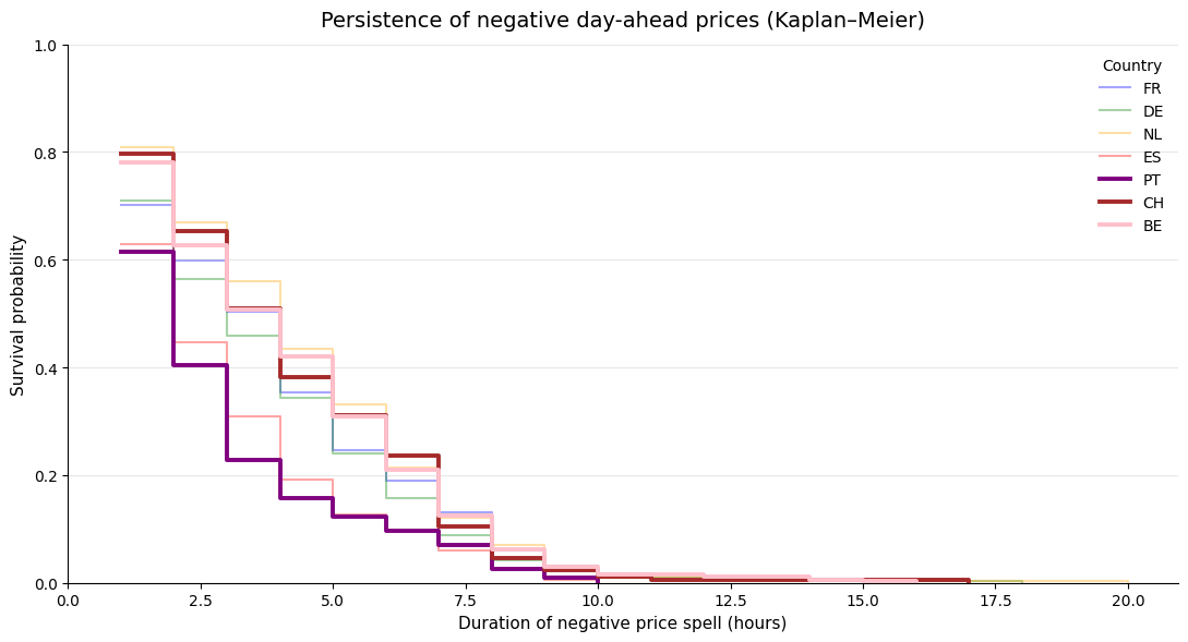
As it could have been expected, Portugal behaves very similarly to Spain: its curve drops faster than all others, confirming that negative prices there are mostly short-lived events. Once prices turn negative in Portugal, they usually resolve within a couple of hours, with very little mass in the long tail. Switzerland sits at the opposite end of the spectrum. Negative price spells are less frequent, but when they occur, they tend to persist: the Swiss curve stays above most others for several hours, signaling a higher risk of long-lasting regimes. Belgium, meanwhile, behaves much closer to the core continental markets. Its survival curve largely overlaps with France and the Netherlands, both in the early phase and in the tail, suggesting that negative prices in BE are neither particularly fleeting nor exceptional. Taken together, these curves highlight a clear gradient across Europe: Portugal at the “short and sharp” end with Spain, Switzerland in the “rare but sticky” category, and Belgium in the group of structurally exposed markets alongside FR, DE and NL.
Evolution over the period
Let’s take the example of Germany and France to compare how the persistence of negative prices spells evolve in these two countries.
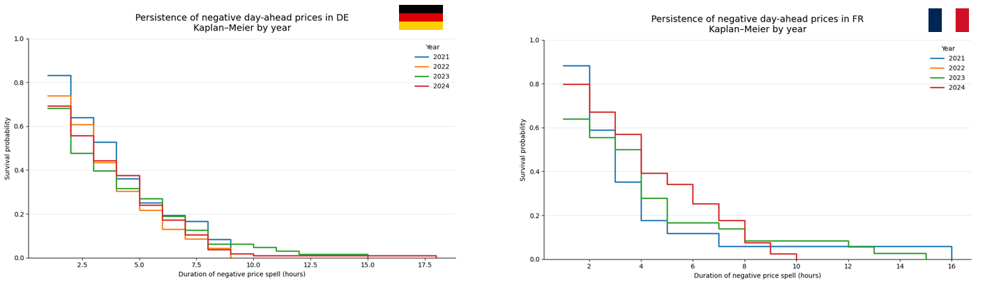
Looking at the yearly curves, France and Germany tell two very different stories. In France, the survival curves gradually shift upward over time: negative price spells not only occur more often, they also tend to last longer once they start. The change is most visible after a few hours, suggesting that recent negative prices are increasingly driven by structural conditions rather than short-lived imbalances. Germany, on the other hand, looks remarkably stable: survival curves from different years largely overlap, and long negative spells were already a feature of the market years ago. In that sense, Germany feels like a system that has already adapted to high renewable penetration, while France still appears to be in the middle of that adjustment process.
Impact of Renewable Penetration
The second part of this article will be devoted to Cox models, which allow us to analyse more precisely the drivers of negative price persistence. However, even with a simple Kaplan–Meier estimator, we can already gain valuable insights into the role of system conditions. Using ENTSO-E data (forecasted wind and solar generation, and forecasted load), we compute for each day the forecasted renewable penetration during peak hours (8h–20h), defined as the ratio of forecasted renewable production to forecasted load. By discretising this variable into penetration bins, we can directly compare the persistence of negative price spells across different renewable regimes.
The table below aggregates this information across all countries in our dataset (France, Germany, the Netherlands, Belgium, Portugal, Spain, and Switzerland):
| Forecasted REN penetration (bin) | Number of spells | Mean duration (h) | Median duration (h) | Std. deviation (h) | Avg. penetration (%) |
|---|---|---|---|---|---|
| 0–20% | 78 | 3.59 | 3.0 | 2.87 | 9.20 |
| 20–40% | 483 | 3.56 | 3.0 | 2.53 | 31.38 |
| 40–60% | 466 | 3.61 | 3.0 | 2.52 | 49.94 |
| 60–80% | 484 | 3.83 | 3.0 | 2.90 | 69.52 |
| >80% | 267 | 4.44 | 4.0 | 2.75 | 91.94 |
The first four bins exhibit the same median duration and very similar averages. Based on this table alone, the effect of renewable penetration on negative price persistence does not appear linear. Instead, it seems to behave like a threshold effect: once a certain penetration level is exceeded, negative price spells start to last significantly longer.
This interpretation is reinforced by the Kaplan–Meier curves below:
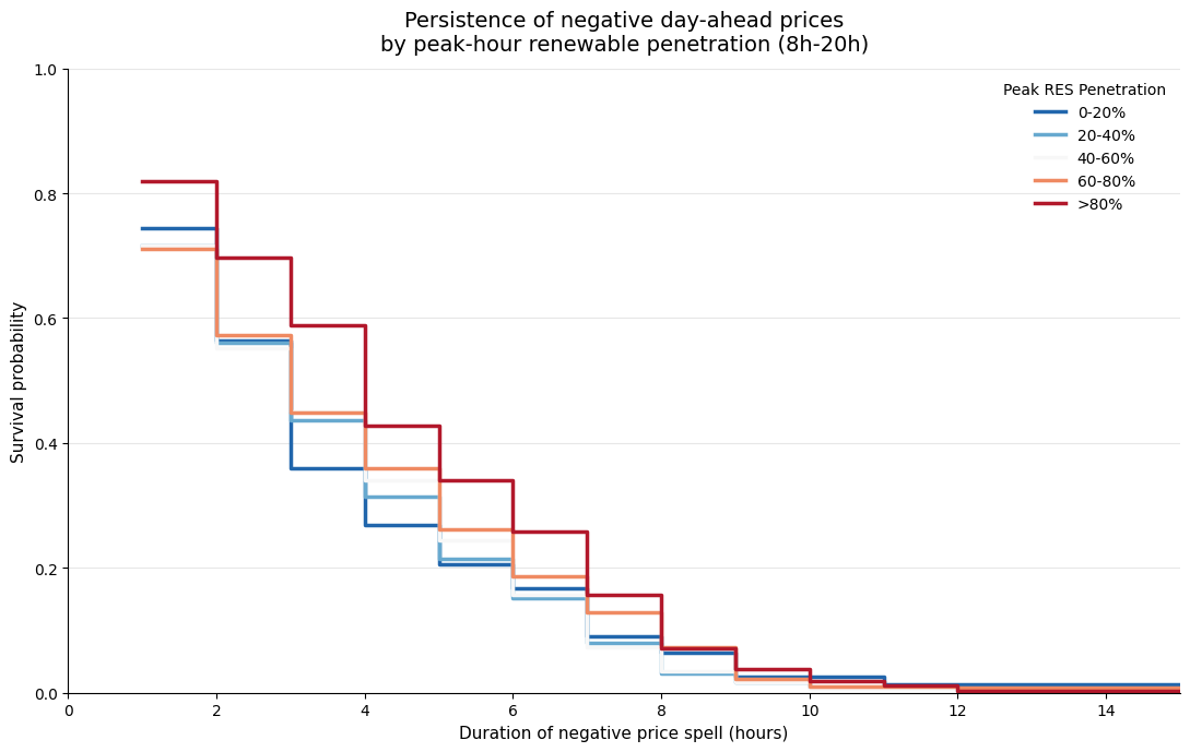
The red curve — corresponding to peak-hour renewable penetration above 80% — clearly dominates the others, which remain tightly clustered. However, this first view mixes several markets with very different structures. To better understand the underlying mechanisms, it is more informative to look at the same breakdown country by country.
The figure below focuses on France, Germany, the Netherlands, and Spain:
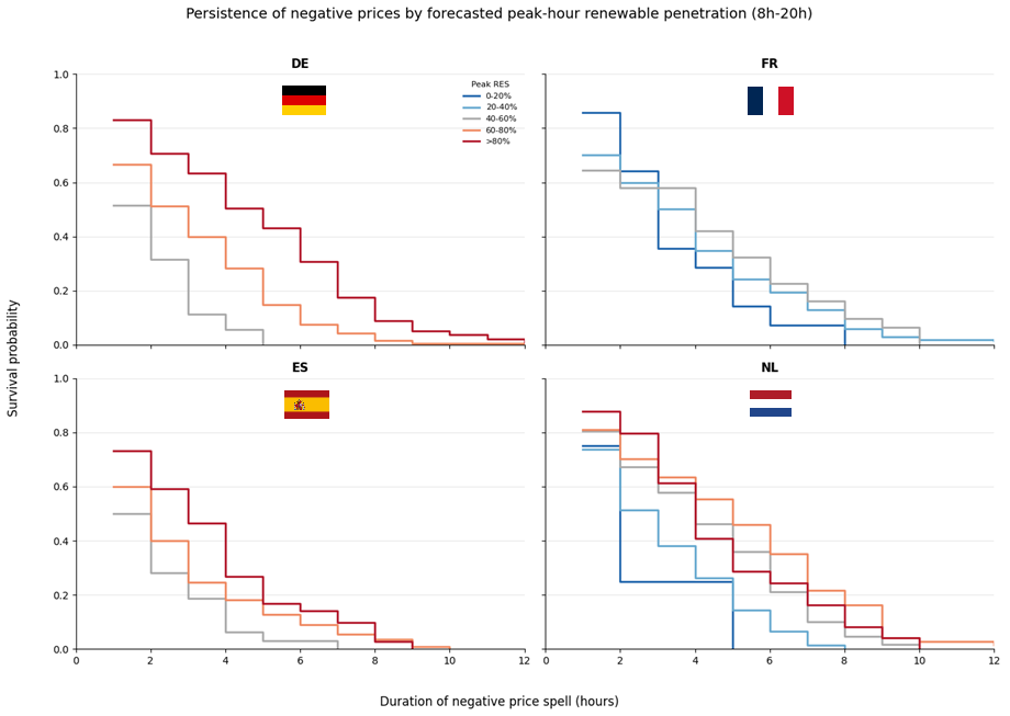
Across all four markets, higher renewable penetration during peak hours is associated with more persistent negative price spells — but the strength of this relationship varies markedly.
Germany exhibits the cleanest and most monotonic pattern: as peak RES penetration increases, the survival curves shift upward almost systematically. This suggests a strong structural link between renewable oversupply and price persistence. Spain shows a similar ordering, but with a faster overall decay, indicating that even high-RES situations tend to resolve more quickly.
France stands out by contrast. The curves remain relatively close across penetration bins, suggesting that renewable penetration alone does not fully explain persistence. Other constraints (such as nuclear inflexibility, export capacity, demand shape) seem tp play a major role. The Netherlands sits somewhere in between, with a visible RES effect but substantial overlap across bins, hinting at a system where flexibility can partially absorb renewable shocks.
Taken together, these results suggest that renewable penetration is a necessary but not sufficient condition for persistent negative prices. Whether oversupply translates into a short-lived anomaly or a prolonged regime ultimately depends on market design and system flexibility, a question we will revisit more formally using Cox models.
Reference sources
- Kaplan, E. L., & Meier, P. (1958). Nonparametric Estimation from Incomplete Observations. Journal of the American Statistical Association.
- Cox, D. R. (1972). Regression Models and Life-Tables. Journal of the Royal Statistical Society: Series B.
- Zamundio López, J., & Zareipour, H. (2025). Modeling the Duration of Electricity Price Spikes Using Survival Analysis.
- Martin, T., et al. (2018). Investigation into Modeling Australian Power Transformer Failure and Retirement Statistics.
- Barbosa de Santis, R., et al. (2023). A Data-Driven Framework for Small Hydroelectric Plant Prognosis Using TSFRESH and Machine Learning Survival Models.